

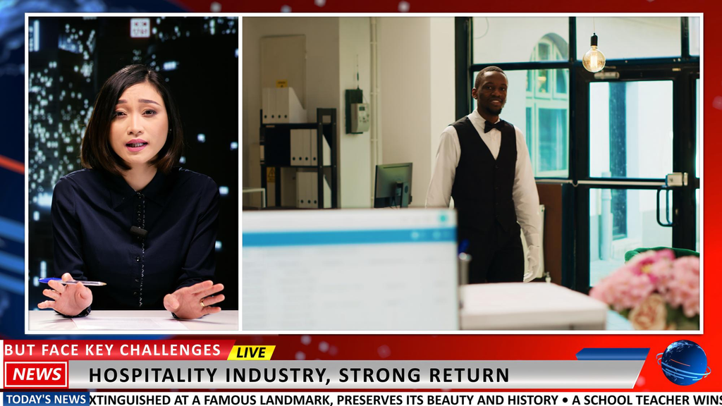
Anyone who has watched a live news broadcast, a conference keynote, or a sports event has seen lower thirds without necessarily thinking about them directly. Those name and title banners, sponsor logos, and rolling tickers along the bottom of the screen do a surprising amount of work, quietly delivering context that helps viewers follow along without interrupting the footage itself.
Behind that simplicity sits a fair amount of planning, design, and technical coordination, the kind of detail that separates polished Broadcast Video Production in Hawaii from coverage that feels improvised or amateur.
What Lower Thirds Actually Do
A lower third is a graphic overlay positioned in the lower portion of the screen, typically used to identify a speaker, display a title or location, or reinforce a sponsor or event brand. Its purpose is informational as much as visual. A well designed lower third answers a viewer’s unspoken question, who is this person, or what am I looking at, without requiring a narrator to explain it out loud. Because these graphics appear over live video rather than in a static slide, they need to be legible instantly, since viewers typically have only a few seconds to read them before their attention moves elsewhere.
Common Types of Broadcast Graphics Beyond Lower Thirds
Lower thirds are the most familiar example, but broadcast graphics cover a wider category of on-screen elements. Tickers scroll ongoing information along the bottom or side of the frame, often used for schedules, sponsor messages, or live updates during a conference. Full screen graphics can introduce a new segment or speaker before returning to live video. Scoreboards, countdown timers, and live data overlays serve a similar informational purpose in sports and competitive event coverage. Each of these elements needs to be designed with the same core principle as a lower third, delivering information clearly without competing with the video underneath it.
Design Principles That Keep Graphics Readable
Good broadcast graphics balance visual appeal with pure legibility. Font choice matters significantly, since ornate or overly stylized typefaces can look attractive in a static design mockup but become difficult to read once animated over moving video. Contrast between text and background is equally important, particularly for events that will be viewed on a range of screens, from large venue displays to small mobile devices during a livestream. Consistent placement and sizing across an event also matters, since viewers subconsciously learn where to look for information once a pattern is established early in the broadcast.
How Graphics Are Delivered Technically
Modern broadcast graphics are typically generated and controlled through dedicated character generator software, often paired with a production switcher that layers the graphic over live camera feeds in real time. Templates are usually built in advance, allowing an operator to update names, titles, or scores quickly during a live event without redesigning the graphic from scratch each time. This template based workflow is essential for events with many speakers or segments, where manually creating a new graphic for every transition would be far too slow to keep pace with a live production schedule.
Timing and Animation Matter More Than They Appear To
The way a graphic enters and exits the screen affects how professional a broadcast feels almost as much as the design itself. Abrupt, poorly timed graphics can feel jarring, while graphics that linger too long can block important video content or start to feel stale. Skilled production teams coordinate graphic timing closely with the flow of the event itself, bringing a lower third in shortly after a new speaker begins talking and removing it before the moment when it would otherwise become a distraction rather than a helpful reference.
Integrating Real Time Data Into Live Graphics
Many modern events call for graphics that update dynamically rather than remaining static throughout a broadcast. Live polling results, social media hashtags, sponsor rotations, and real time scoring all require graphics systems that can pull in outside data and reflect it on screen without manual intervention for every update. Building this kind of integration requires planning well before the event itself, ensuring that the data source, the graphics engine, and the broadcast workflow are all properly connected and tested ahead of time rather than configured under pressure once the event is already underway.
Why Coordination With the Broader Production Team Matters
Graphics do not exist in isolation from the rest of a broadcast. They need to align with camera switching, audio cues, and the overall pacing of an event, which means the graphics operator typically works in close coordination with directors, camera operators, and audio engineers throughout a live production. This kind of coordinated approach, often built around the same high resolution imagery standards discussed in Mid-Pacific Audio Visual‘s overview of large event visual production, is part of what allows graphics to feel like a natural extension of the broadcast rather than an added layer competing for attention.
The Quiet Value of Getting Graphics Right
Broadcast graphics rarely draw attention to themselves when they are done well, which is exactly the point. Clear, well timed lower thirds and supporting graphics give viewers context without pulling focus away from the actual content of an event. For any production aiming for a polished, professional result, the planning behind these small on-screen details deserves just as much attention as the cameras and audio systems that capture the event itself.
